Dudley Square Loft
dudley square loft
Boston, MA
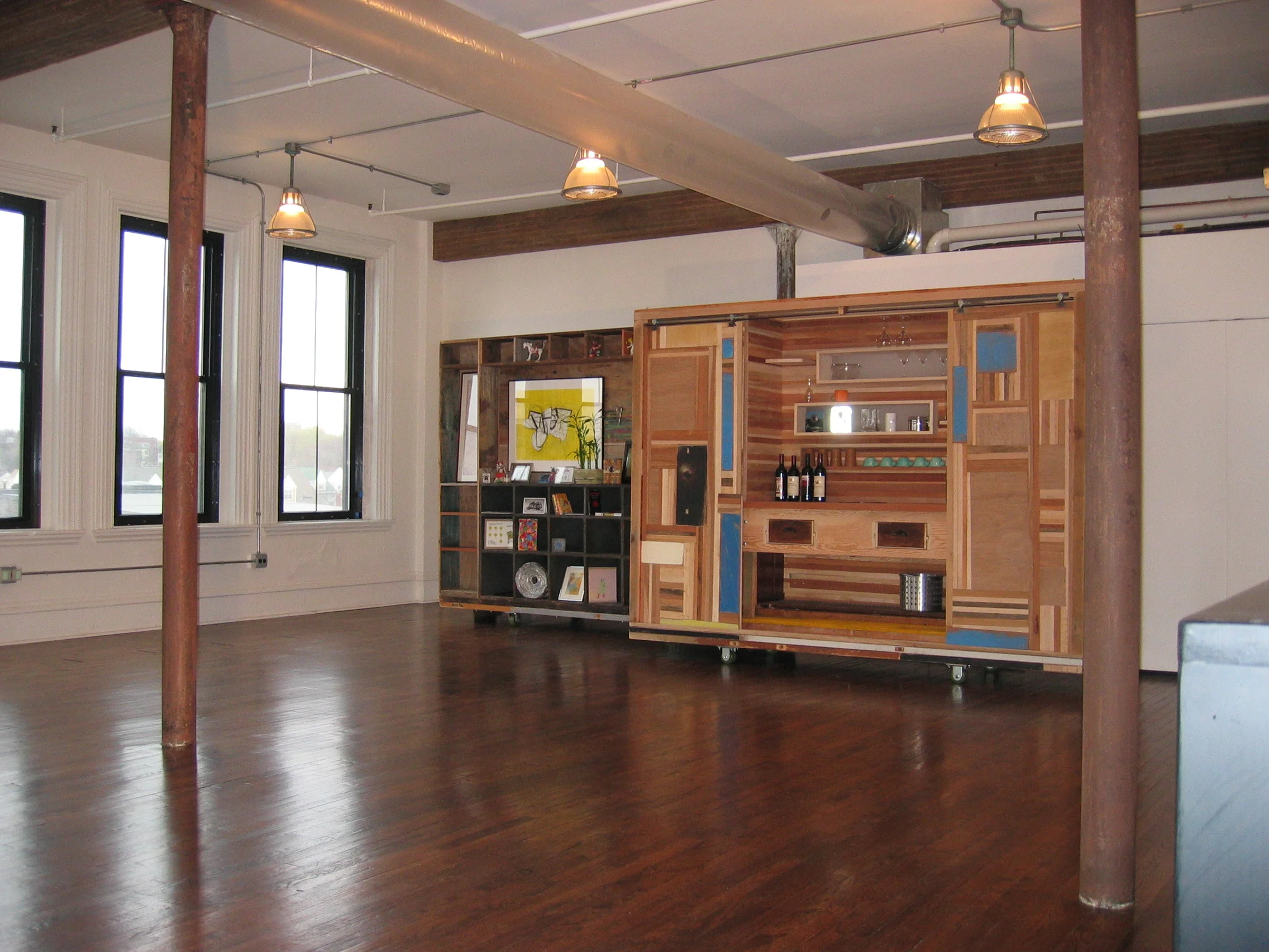
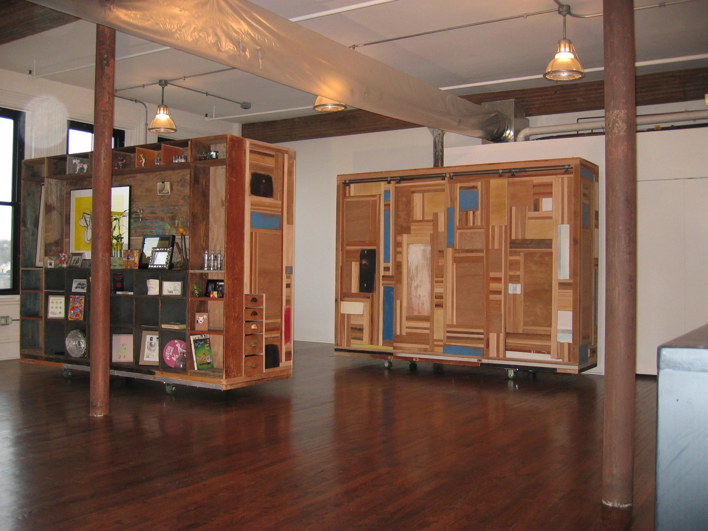
This project responds to a desire to balance art, architecture and the necessities of day to day living. This design was driven by a minimal budget and several strong, distinctive concepts:
1. Openness - minimal use of partitions to define spaces.
2. Plug & play - the creation of a basic “canvas” to which you may add elements over time.
3. Endless space - allowing for continuous passage around constructions so that movement never dead-ends in one room.
4. Flexibility - spaces are easily reconfigured. In this case simply rolled to create larger or smaller spaces.
PUBLICATION
“The Art-House Crowd”
Design New England
PRESENTATION
“Loft Planning & Design”
Design Within Reach, Boston MA
PUMA VIDEO LOCATION
Introducing new sneaker design
“The bathroom is like a jewel inside a rock. I like playing solids and voids off of each other, so the distinction becomes blurred. We ran color in bands down the walls and across the floor so it feels like you are inside a layer cake that has been hollowed out. .” – Joseph Kennard
Kennard making good use of the modest kitchen, whipping up fish tacos for friends.
DISTINGUISHING DETAIL
“For me, lofts have always been about occupying (existing) buildings and not having enough money to build out anything more than temporary walls… It’s about being really efficient with what we built and incredibly minimal with materials.” – Joseph Kennard


